Public Sector
Modernizing the Wyoming 4-H State Website
A 76-page digital ecosystem rebuilt from a link-heavy legacy site into a scalable, accessible, six-pillar architecture that finally connects learning a skill with signing up to do it.
- Role
- UX / Product Designer
- Timeline
- Jul – Nov 2025 (5 months)
- Team
- University of Wyoming Extension
- Tools
- Figma, information architecture, UX survey
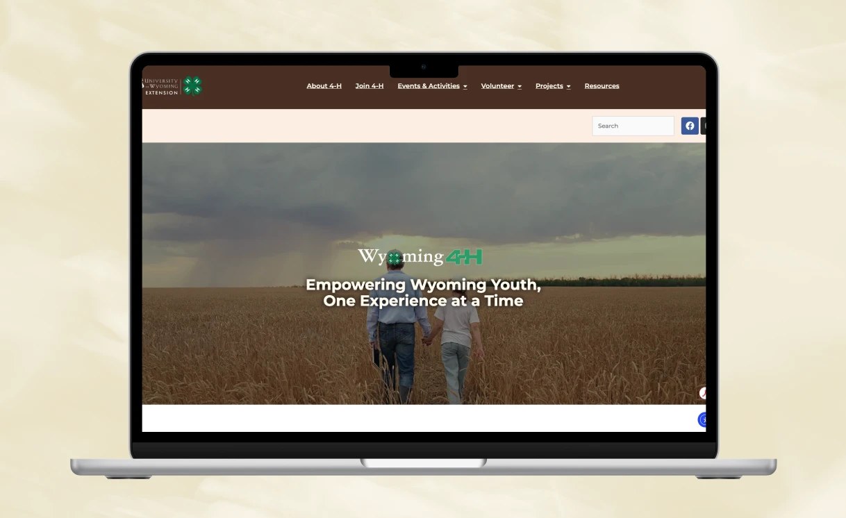
Wyoming 4-H is the state's youth development program, from Animal Science to Robotics to Cake Decorating. Its digital home had grown to 76 unique pages with no logical hierarchy, so the people who needed it most couldn't find their way through it.
My job was a digital-ecosystem revamp: scalable layout systems, accessibility compliance, and a long-term governance model that holds up as the program grows.
Who it's for
Two very different users have to share one website, a 15-year-old chasing a statewide contest, and a 6-year-old exploring with a parent. The design had to serve both without overwhelming either.
Ages 8–18
The Driven Competitor
Has progressed from basic projects to statewide competitions, building professional skills for a future in agriculture or food science.
- →Find contest rules and prep materials for events like Meat Judging or the State Shoot
- →Apply for the State 4-H Leadership Team to mentor younger youth
- →Download project manuals and guidebooks to work independently at home
Cloverbuds · Ages 5–8
The Curious Explorer
A newcomer excited to explore Soil, Robotics, or Cake Decorating, usually navigating the site with a parent or adult volunteer.
- →Discover age-appropriate activities through the Clover Buds section
- →Try basic skills, like learning decorating tips for a cake
- →See photos from past events to feel part of a community
Navigating massive complexity
Managing a vast digital library of 76 pages across diverse domains, built on a legacy layout that relied on link-heavy indexes rather than a logical hierarchy. The result was high cognitive load for a massive, diverse audience with no clear navigation strategy to guide them.
But the deeper problem wasn't volume, it was broken journeys:
- "Learning" and "Doing" were disconnected. Educational project content (skills) lived apart from event participation (application), so users struggled to find rules, dates, and locations for high-stakes contests like Meat Judging or Showcase Showdown.
- There was an accessibility gap. The existing site lacked a robust inclusive-design layer, failing the program's core value of Equity & Inclusion for youth with different visual or cognitive needs.
Reframing the problem
This was not just a website problem, it was a system design problem. Layouts were inconsistent across pages and counties, content lacked clear hierarchy, navigation relied on long lists instead of structured pathways, and actions like "Sign Up" or "Learn More" weren't embedded in context.
Goals & objectives
- Establish a scalable content framework, turn 76 pages of fragmented information into a high-performance architecture that stays easy to navigate as the program grows.
- Bridge the "learning-to-doing" gap, create seamless journeys from project exploration (e.g. Cake Decorating) to active event participation (e.g. Showcase Showdown).
- Empower every user group, serve youth ages 5–18 and adult volunteers with context-specific resources, like manuals and training guides, at the exact point of need.
From fragmentation to logic: six pillars
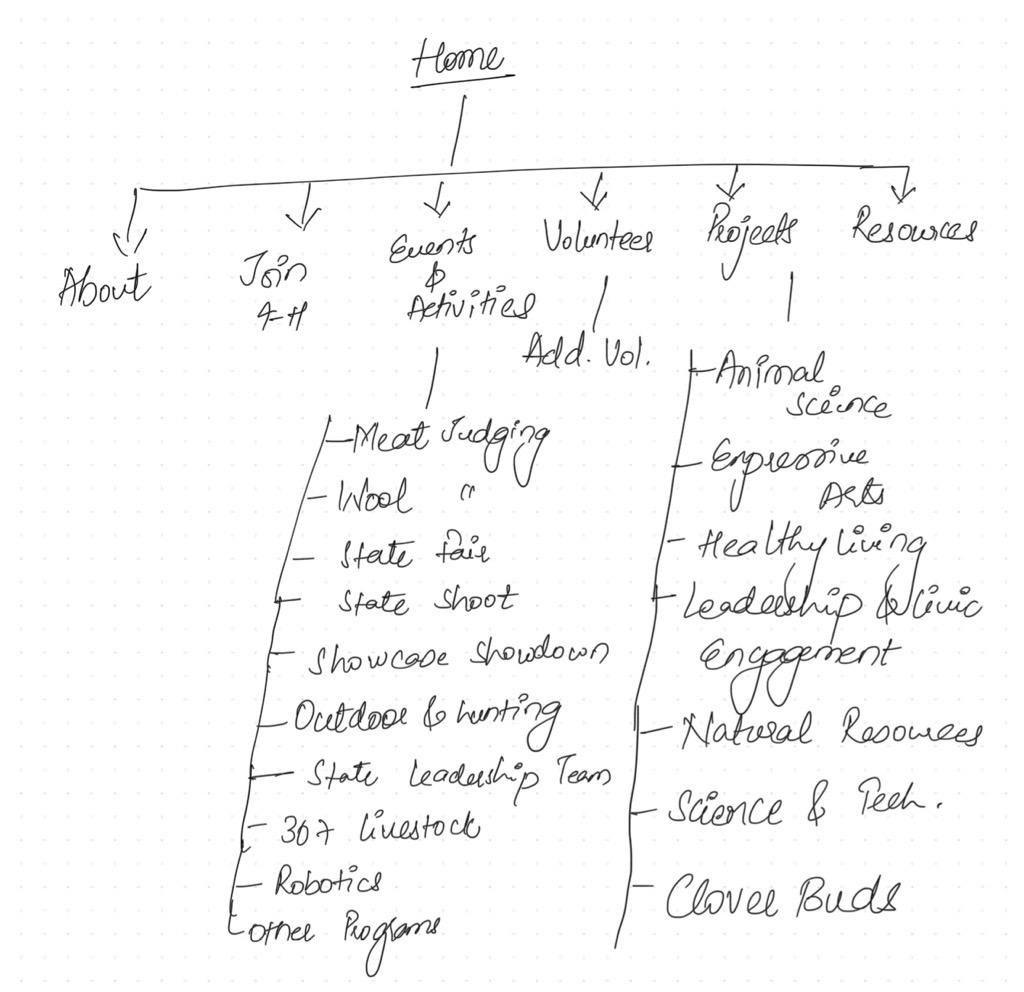
I transformed the link-heavy legacy architecture into a streamlined system centered on six primary pillars, clustering the 76 pages into thematic hubs that reduce cognitive load.
Animal Science
13 sub-pages, Beef Cattle to Veterinary Science
Expressive Arts
12 sub-projects
Healthy Living
Foods, gardening, outdoor recreation
Leadership & Civic Engagement
Civic engagement, youth leadership
Natural Resources
Soil, wildlife, the outdoors
Science & Technology
Robotics and beyond
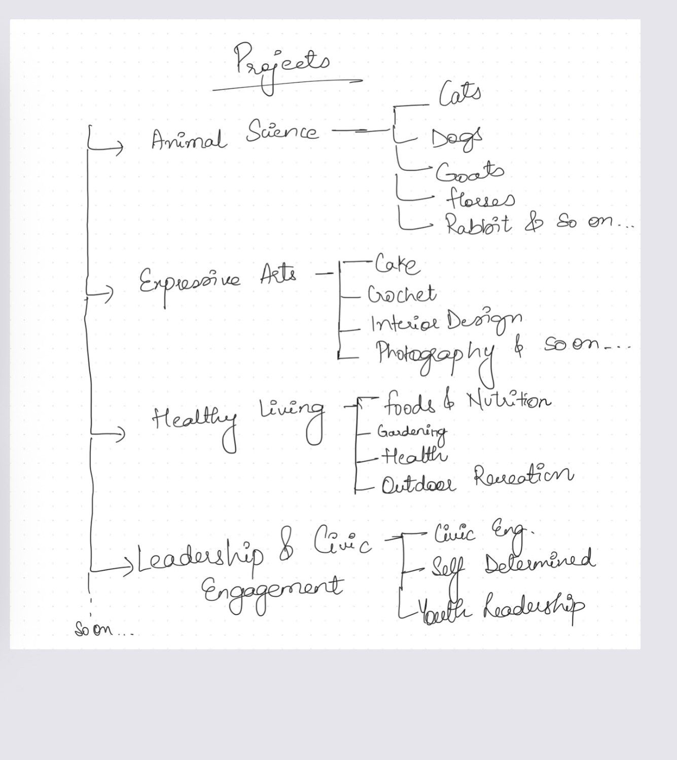
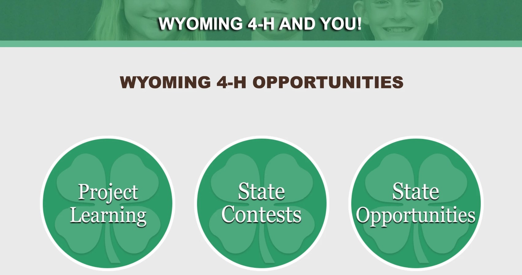
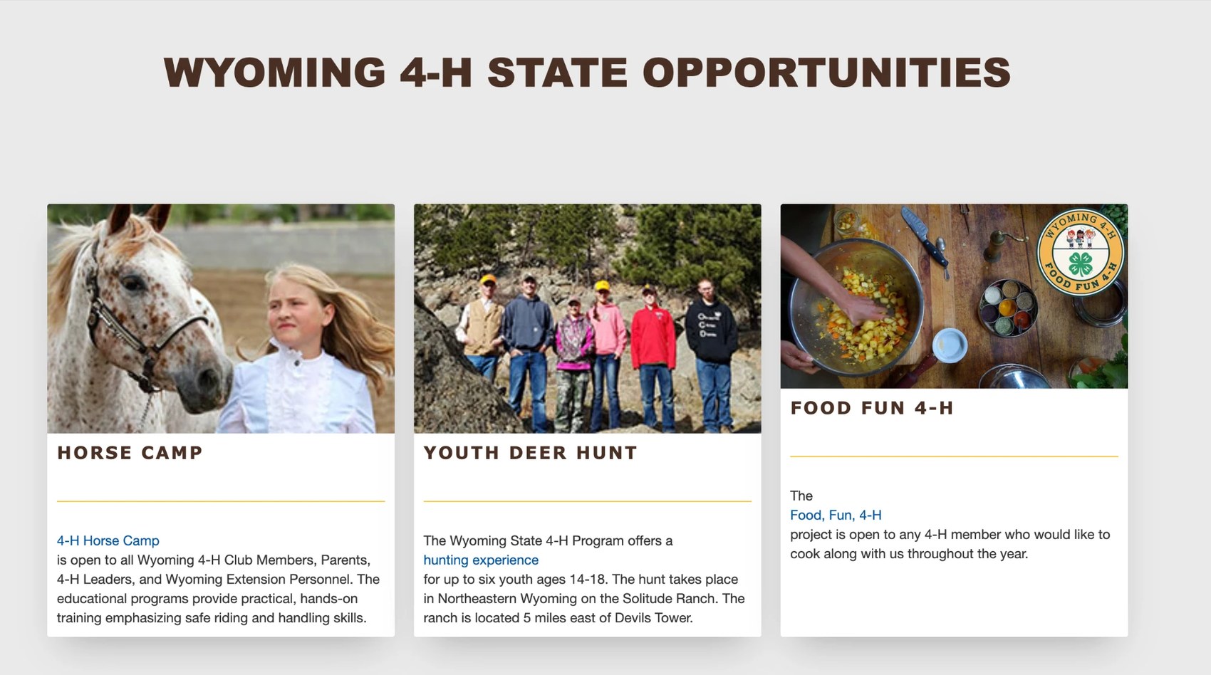
For example, the Animal Science hub now neatly houses 13 sub-pages that were previously disjointed. A progressive-disclosure model handles deep density, like the 12 Expressive Arts sub-projects, without cluttering the primary journey. And a clear separation between Projects (skill building) and Events & Activities (active participation) means users can always tell the difference between learning a skill and competing in it.
Wireframing the solution
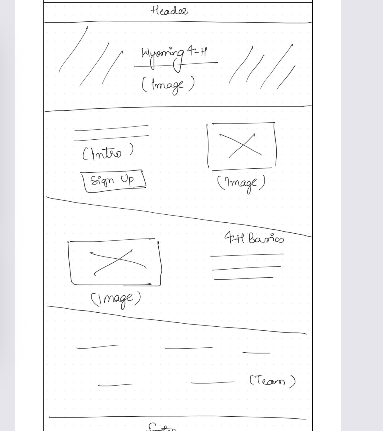
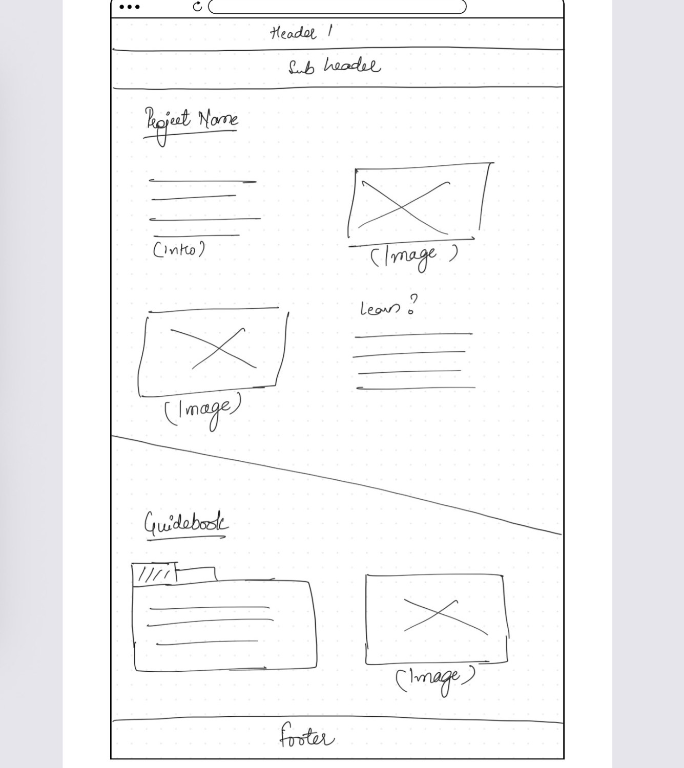
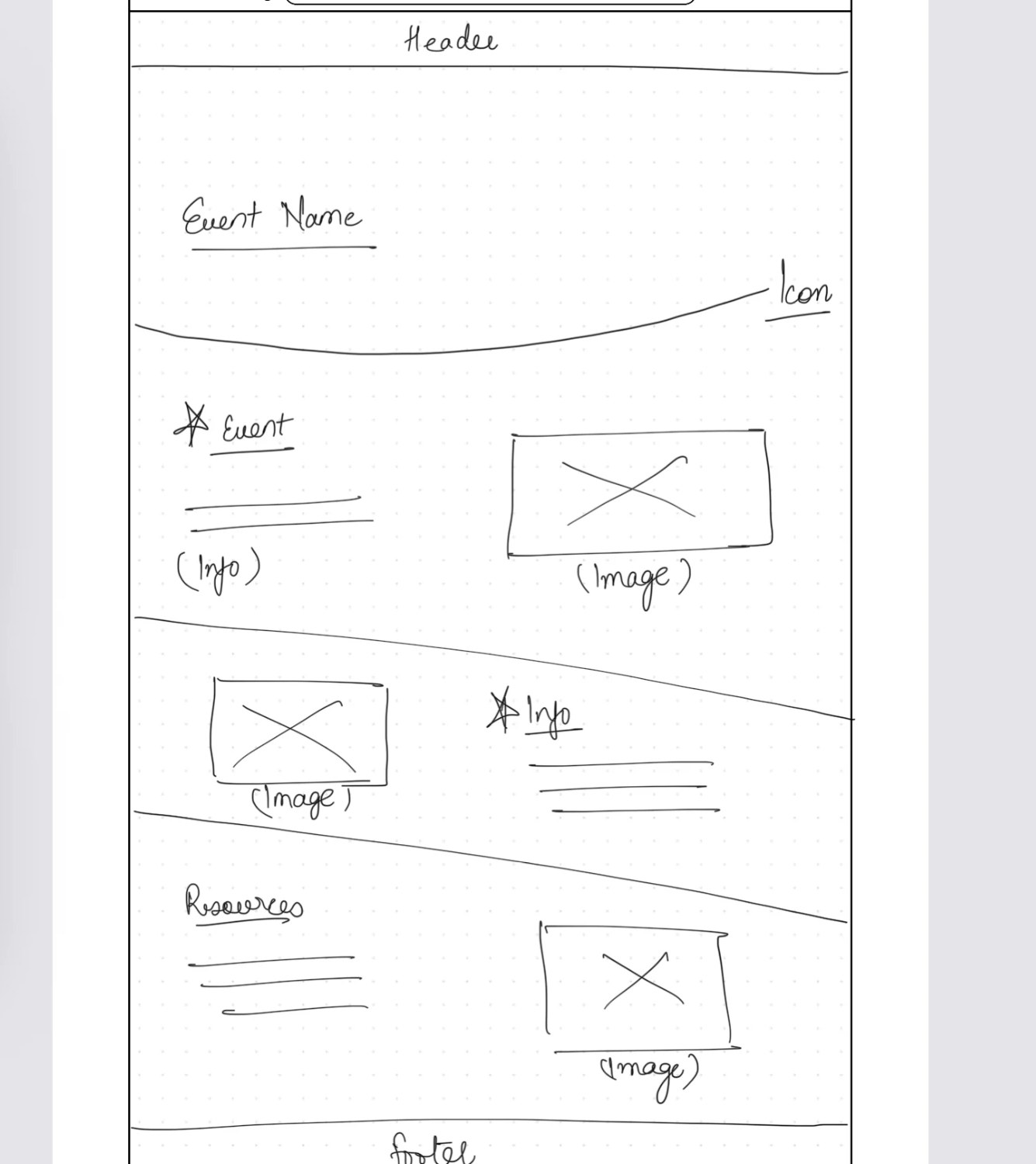
I wireframed the repeatable page types, homepage, project page, event page, so every page in the ecosystem would behave the same way.
A one-stop-shop for high-stakes events
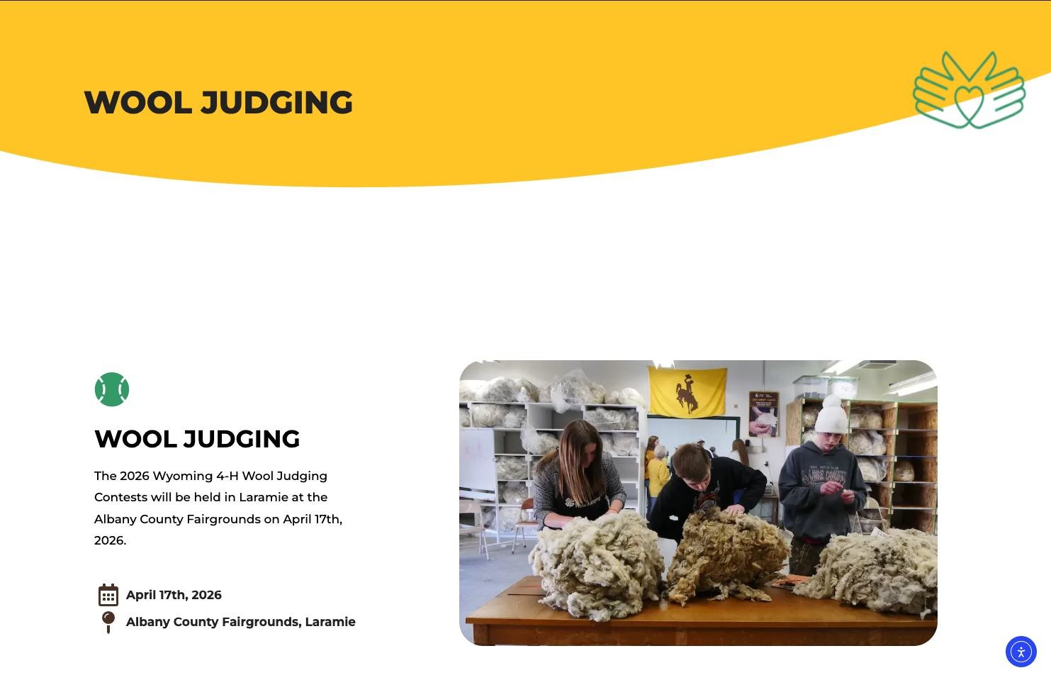
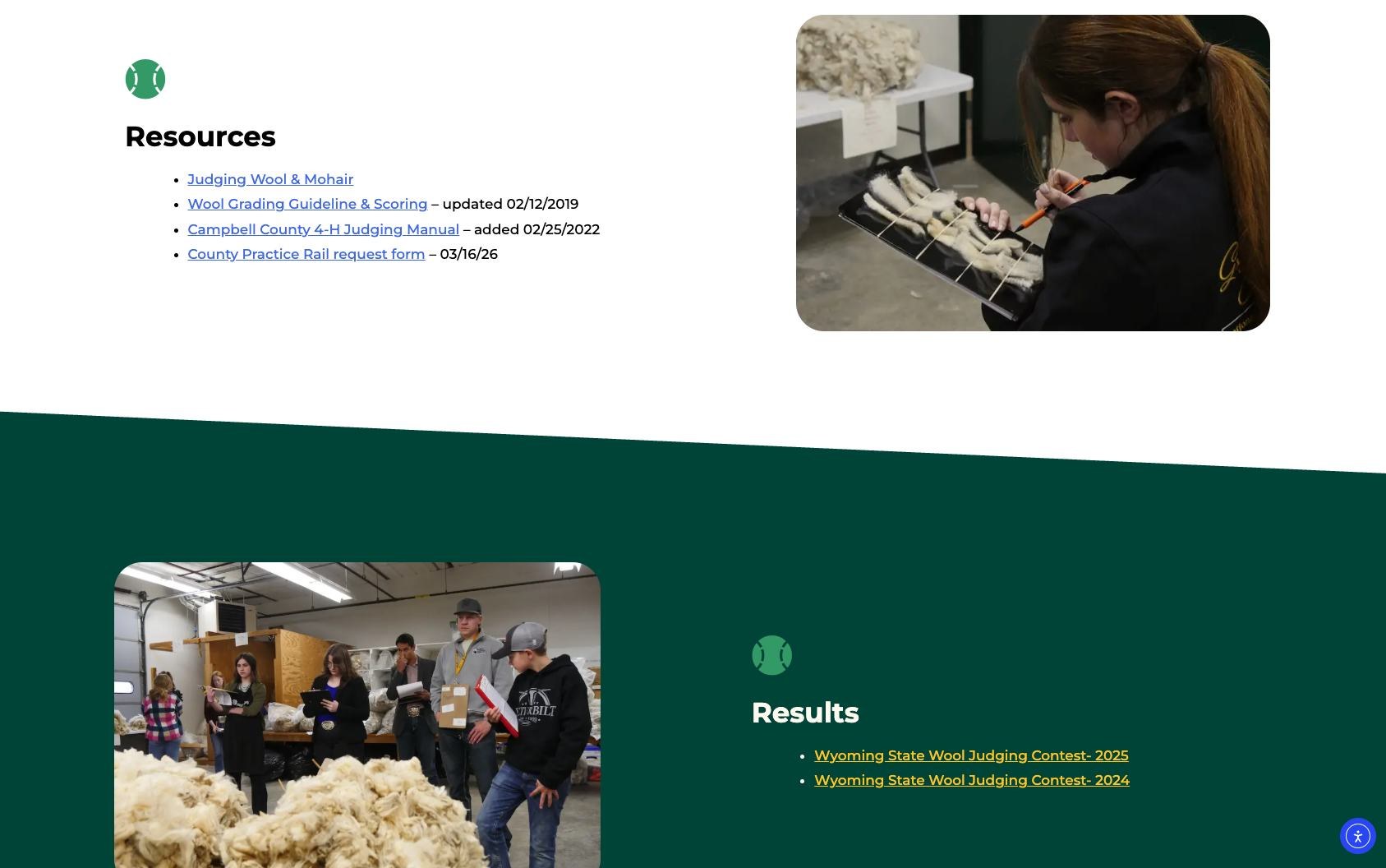
I replaced fragmented links with a comprehensive landing page for events like Wool Judging. The essential logistics, Date (April 17th, 2026) and Location (Albany County Fairgrounds, Laramie), sit at the top of the page, so users stop "hunting." Resources and Results for any event live in one predictable place.
Turning static descriptions into action
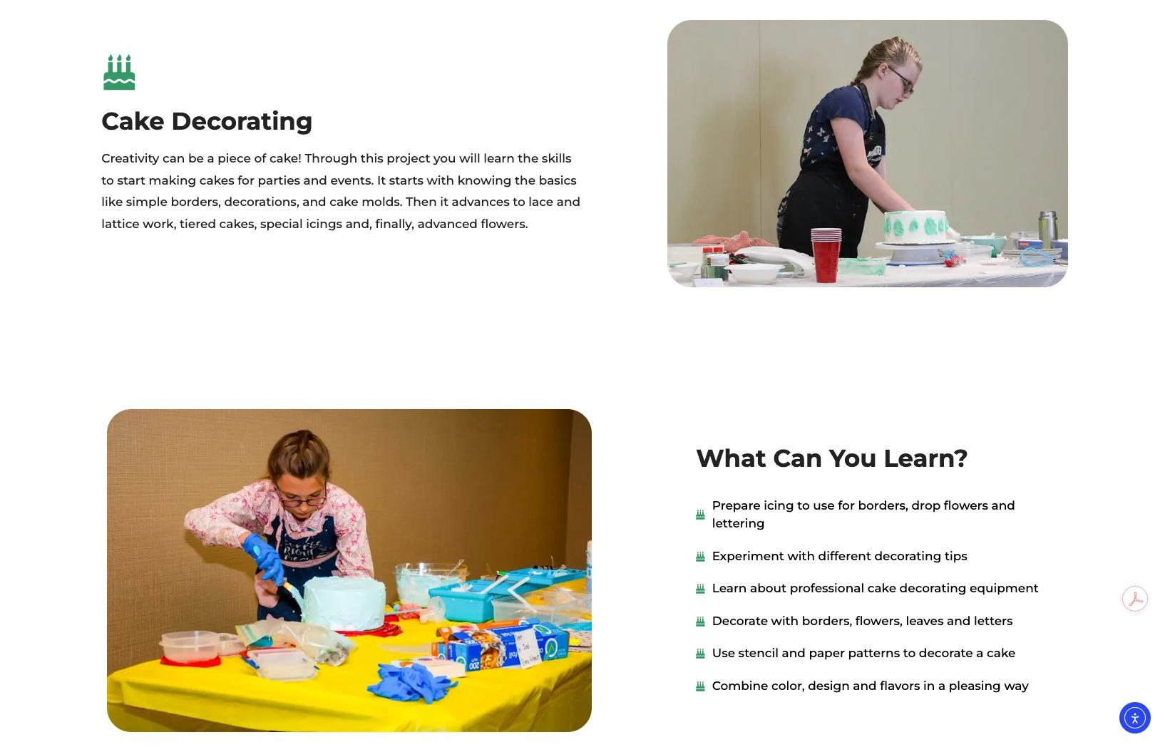
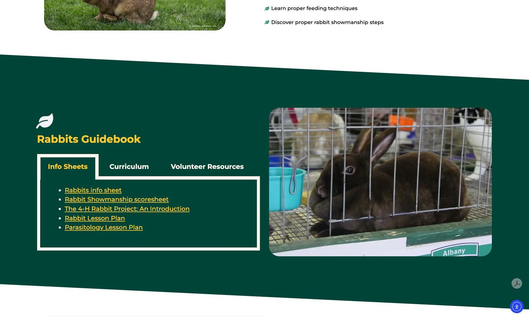
I moved projects beyond static descriptions by explicitly answering "What can you learn?", and put resources at the point of need with a tabbed hub that organizes Info Sheets, Curriculum, and Volunteer Resources in one component. A clean, card-based layout keeps the dense ecosystem readable, even for early readers.
A universal accessibility layer
Inclusive design isn't a feature, it's a core design value. To make the site usable by all youth regardless of background or circumstance, I made it ADA compliant across all 76 pages: stronger contrast, clearer typography, and alt text on every image. For a program committed to Equity & Inclusion, this was non-negotiable.
Testing the 76-page ecosystem with its community
I launched a targeted UX survey with members, parents, and extension staff to test whether the six-pillar hierarchy and new labels actually reduced the interaction cost, and whether the density still felt overwhelming.
The survey measured four things:
- Findability, how easy was it to find information, and upcoming events or opportunities?
- Information architecture, did the menu labels and page titles make sense?
- Content density, did any page still feel overwhelming, and which one?
- Task completion, were users able to finish what they came to do, and what's the one thing they'd improve first?
What it made possible
pages reorganized into six clear content pillars
disjointed Animal Science pages unified into one hub
accessibility compliance across all 76 pages
What I learned
- Information architecture is the foundation. A logical six-pillar hierarchy is the only thing that turns link-heavy chaos into a scalable, high-performance library.
- Accessibility is a primary component, not a bolt-on. Integrating ADA compliance across the entire site is what makes a digital home usable by every youth in Wyoming.
- Validation comes from the community. A design is only successful once its users confirm it, the UX survey taught me to iterate continuously on the real needs of youth, parents, and volunteers.
What's next
Youth success stories and photos to build community, registration countdowns and deadline alerts on the event pages, and a specialized Clover Buds mode (ages 5–8) that prioritizes visual discovery over text.