Ecology / Non-profit
Designing Greenstand's system, from brand tokens to the tools people use every day
I built Greenstand's original brand system, helped the team build Roots, the product design system that grew out of it, and designed the admin console, the Capture Matching tool, and a mobile token wallet for this open-source, global tree-planting platform.
- Role
- Product Designer & Researcher
- Timeline
- Apr 2023 – Dec 2024
- Team
- Distributed open-source designers & engineers
- Tools
- Figma, FigJam, interviews, usability testing
A platform built by many hands, with no shared visual language
Greenstand is an open-source platform that tracks trees and pays the people who plant them. Growers capture photos of trees in the field. Reviewers verify those captures. Organizations fund planting and reward people with tree tokens.
Its tools were built by volunteer teams with no shared visual language, so every product looked and behaved differently. Reviewers moving between tools had to learn a new interface each time, and engineers rebuilt the same parts again and again.
What I owned
- Brand systemBuilt Greenstand's original brand system: logo usage, color tokens, a contrast-tested color matrix, a 12-step type scale, elevation and border rules.
- Roots design systemWorked with the design team on Roots, the product design system built on these foundations and used across TreeTracker and TreeTrader.
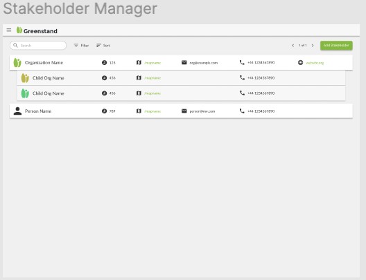
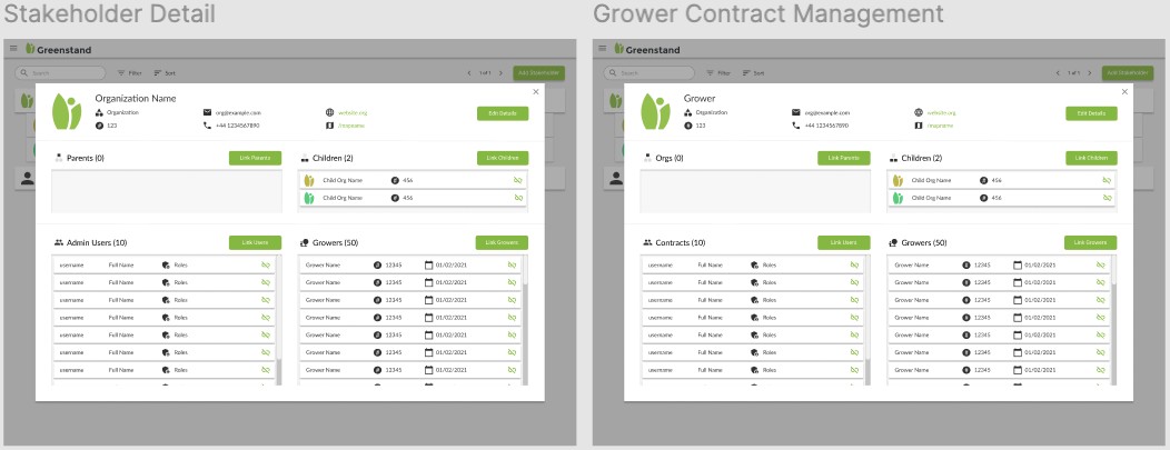
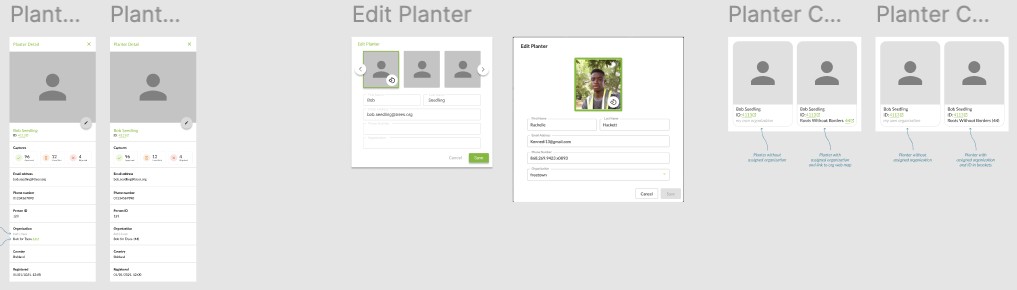
- Admin consoleDesigned the Stakeholder Manager, Stakeholder Detail, Grower Contract Management and Planter screens on the shared component set.
- Capture MatchingWorked on the verification tool reviewers use to match new tree photos to trees already on record.
- Token WalletLead product researcher and designer: interviews, personas, sketches, mockups, prototypes and usability testing.
Brand foundations anyone on the team could pick up
The system had to work for volunteers who might join for a few weeks and never meet the designer. So every rule is written down as a value someone can copy: a hex code, a pixel size, a pairing that is allowed or not.
Color tokens with defined roles
Each color has a job. Sprout is the main action color; Sunrise and Sunset are limited to small accents so they never compete with it.
Sprout
#8BC232
Logo, icons, main CTA
Chlorophyll
#61892F
Supporting, highlights
Sunrise
#FFA500
Small accents, 2nd CTA
Sunset
#FF7A00
Small accents, linework
Moonlight
#6B6E70
Secondary text
Storm
#474B4F
Dark surfaces
Fog
#EFEFEF
Background
Midnight
#222629
Text, dark theme
Accessibility decided once, in the tokens
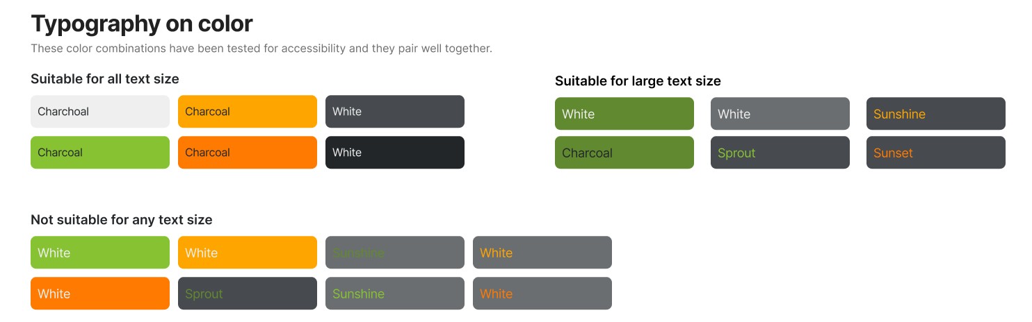
I tested every text and background pairing and sorted them into three groups: safe for all text sizes, safe for large text only, and never. Contributors don't have to run contrast checks, if they use an allowed pairing, the result meets WCAG.
A 12-step type scale
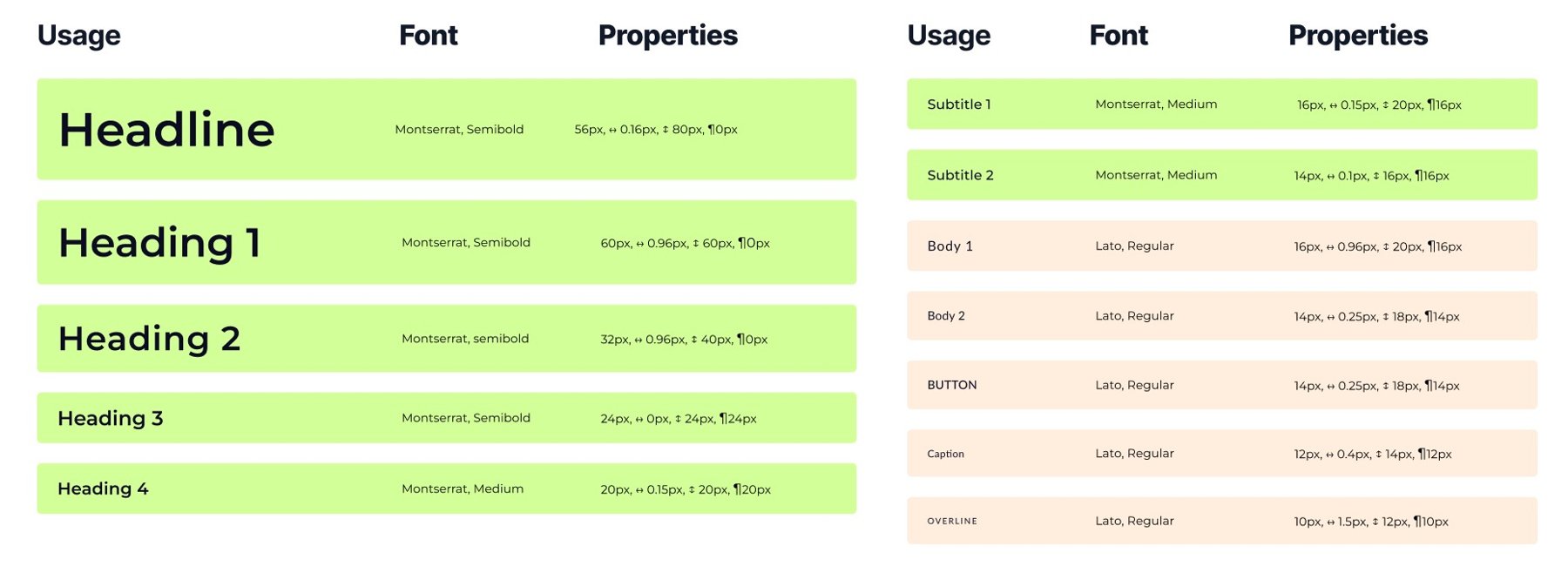
Montserrat carries headings and Lato carries body and interface text. Every style lists size, tracking, line height and paragraph spacing, so engineers can implement it without guessing.
| Style | Font | Size | Tracking | Line height |
|---|---|---|---|---|
| Heading 1 | Montserrat Semibold | 60px | −0.96px | 60px |
| Headline | Montserrat Semibold | 56px | −0.16px | 80px |
| Heading 2 | Montserrat Semibold | 32px | −0.96px | 40px |
| Heading 3 | Montserrat Semibold | 24px | 0 | 24px |
| Heading 4 | Montserrat Medium | 20px | −0.15px | 20px |
| Subtitle 1 / 2 | Montserrat Medium | 16 / 14px | −0.15 / −0.1px | 20 / 16px |
| Body 1 / 2 | Lato Regular | 16 / 14px | −0.96 / −0.25px | 20 / 18px |
| Button | Lato Regular | 14px | −0.25px | 18px |
| Caption · Overline | Lato Regular | 12 · 10px | −0.4 · −1.5px | 14 · 12px |
Elevation and borders
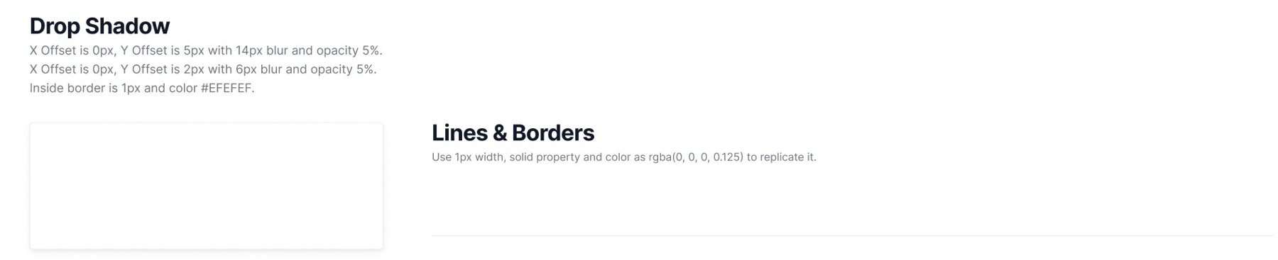
Two shadow levels (Y 5px / 14px blur, and Y 2px / 6px blur, both at 5% opacity) and a single 1px divider at rgba(0,0,0,.125). Fewer choices meant screens built by different people still looked like one product.
From brand foundations to Roots
These foundations became the starting point for Roots, the product design system the team built next. Roots kept Midnight for text and Sunrise and Sunset as rare accents. It moved the main action color to a darker green, because white text on Sprout failed contrast, the same pairing the contrast matrix had already ruled out.
Helping reviewers verify thousands of tree photos
Growers send in new photos of trees they planted. Before anyone gets paid, a reviewer has to decide whether each new capture shows a tree that's already on record. Done badly, this is slow, repetitive work that leads to mistakes. I worked on the Capture Matching tool, which puts the whole decision on one screen.
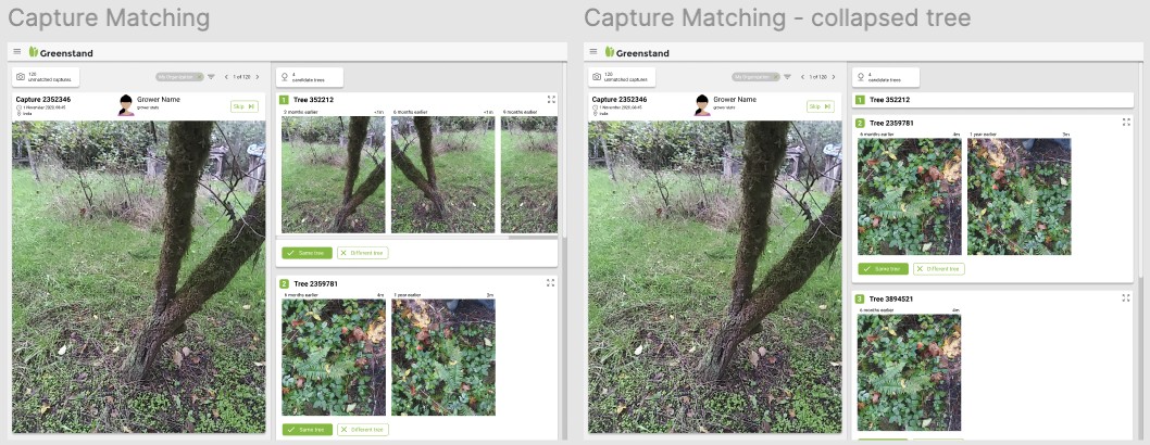
Side-by-side comparison
The new capture sits on the left. Likely matching trees sit on the right, each with its photo history labeled by age, such as “6 months earlier.”
One decision per candidate
Each candidate has two clear actions, “Same tree” or “Different tree,” plus a skip. A queue counter shows how many captures are left.
Collapse what's ruled out
Candidates already rejected collapse out of the way, so reviewers can focus on the rest without losing their place.
Managing organizations, growers and planters on one component set
I designed the screens Greenstand's staff and partner organizations use to manage who plants, who funds and who reviews. Organizations can nest inside other organizations, growers belong to contracts, and planters may or may not belong to an organization. The interface had to show those relationships without becoming a wall of tables.
A mobile wallet for earning, sending and redeeming tree tokens
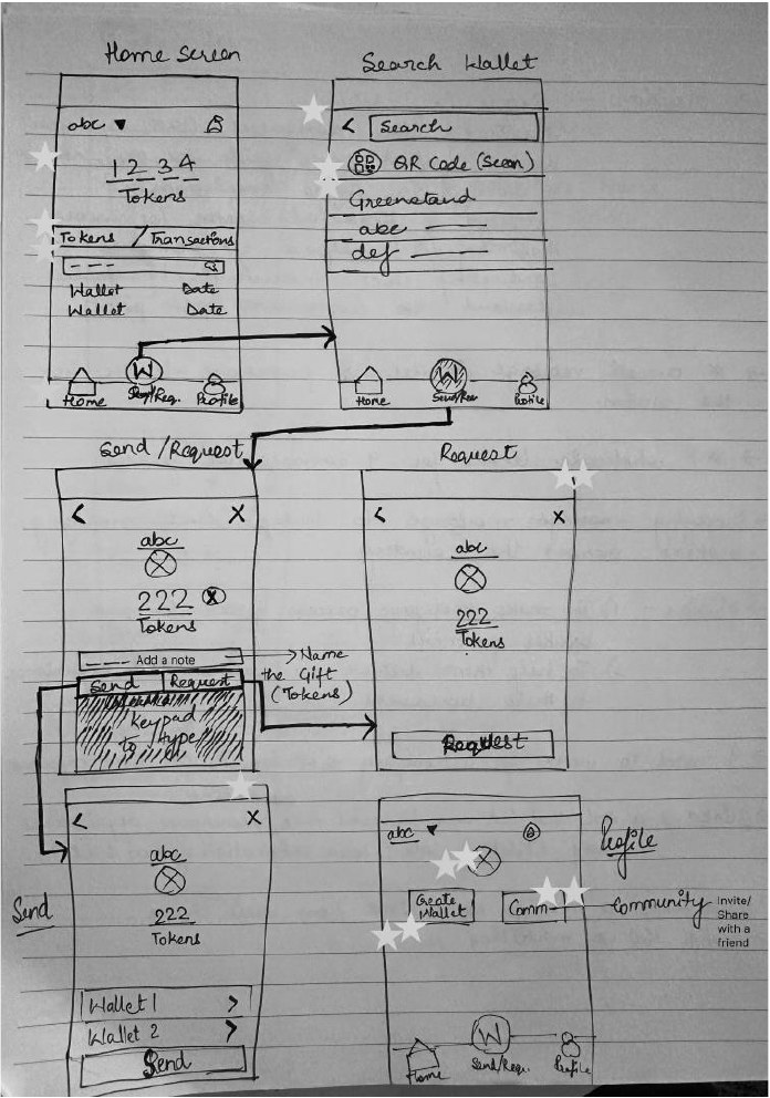
There was no central place to manage and send tree-planting tokens, so businesses and individuals couldn't use them as rewards. The goal was a mobile app that makes sending tokens as easy as sending money, so more tokens circulate and more trees get planted. I was the lead product researcher and designer, covering primary and secondary research, the research plan, usability testing, wireframes and prototypes.
Who it's for: Sam, a restaurant owner
Sam wants to reward loyal customers with trees: good for the planet and good for his brand. Today he has limited loyalty options, can't track impact, and finds giving out rewards slow.
"I want a simple way to show my customers I appreciate their business while also making a positive impact on the planet."
Understanding
People want to help with climate change in a way that feels fun and engaging.
Reward
People want to gift trees as thanks but don't know where to go.
Convenience
Quick token transfers would mean more trees and more awareness.
The whole app, end to end
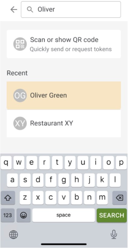
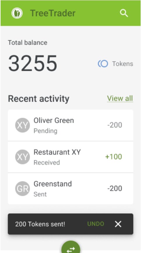
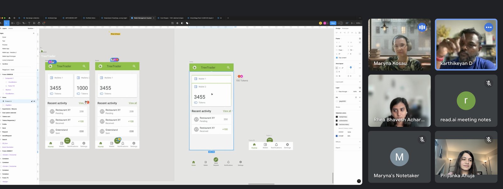
Beyond the core send flow, I designed the full wallet app. For first-time users: splash, onboarding, sign-up, account creation, a first-time home tour, notifications and creating a wallet. For returning users: log in and password reset. Then wallets with limits, details, activity and filters, plus sending and requesting tokens by name or QR code, including empty states when a name isn't found.
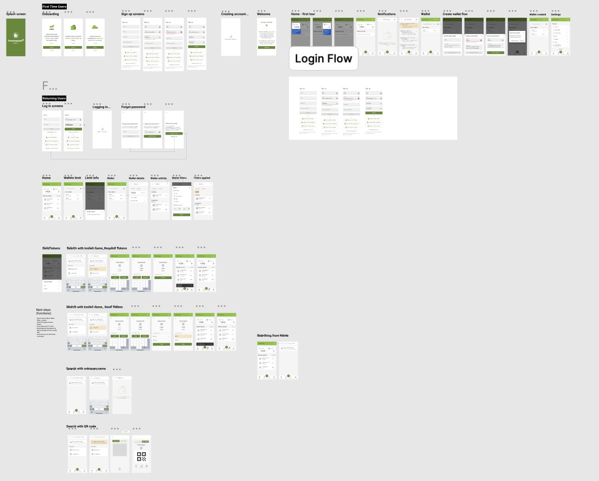
Greenstand is open source and fully distributed, so the wallet came together over working calls across time zones, with the team reviewing screens together in Figma.
What usability testing showed, and what changed
Participants worked through the main tasks while thinking aloud, and I logged where they struggled.
- Users wanted a text label on every button, not only icons.
- The QR code should also be reachable from the profile.
- Wallet and token details looked tappable, but weren't.
Each fix went back into the shared components, so labeled buttons and clear tap targets now apply across the product, not just in the wallet. Next steps: more engaging screens, a web map in the app so people can see where their trees are, and search by token.
What the system made possible
brand foundation that the later Roots design system was built on
contrast groups (all sizes, large text only, never) that make WCAG the default
more efficient tree planting and monitoring through the data-rich web mapping experience
What I learned
In open source, the system is the designer who's always in the room. Writing every rule as a value someone can copy, rather than a principle they have to interpret, is what made it stick with volunteers who come and go.
Accessibility is cheapest at the token level
Testing color pairings once and publishing the result removed a whole class of review comments. Nobody had to remember to check contrast, because the allowed choices were already safe.